CREATIVE BRAND STRATEGY: ASSIGNMENT 2

1. LECTURE
The complete lecture notes are available in the Creative Brand Strategy: Assignment 1 blog.
2. INSTRUCTION
Assignment 2 required us to create a comprehensive Brand Guideline or Brand Book based on the approved Creative Brand Strategy campaign. The guideline needed to act as an official reference for the visual and verbal identity before developing the final campaign applications.
The required sections included:
- Cover page, introduction, and table of contents
- Brand purpose, vision, mission, positioning, and core values
- Brand personality, target audience, key message, and tone of voice
- Primary logo, logotype, logomark, and logo rationale
- Logo construction, clear space, minimum size, variations, and misuse
- Primary, secondary, and supporting colour palettes
- Typography, hierarchy, and usage rules
- Icons, symbols, patterns, graphic devices, and photography direction
- Corporate assets such as letterhead, document cover, and business card
The guideline needed to explain the reasoning behind every decision and show how the logo, colours, typography, icons, imagery, and applications connected with the campaign's mental-health direction, audience, message, and personality.
3. PROCESS WORK
Assignment 2 began by translating the approved FORGED campaign proposal into a complete identity system. The strategy from Assignment 1 became the foundation for the purpose, vision, mission, positioning, values, and tone of voice.
Brand Name: FORGED
Campaign Name: Strength Under Control
Brand Purpose: To guide young men in building strength through discipline, self-control, responsibility, and brotherhood. FORGED exists to challenge destructive ideas of masculinity and help men become grounded, intentional, and controlled in how they live.
Brand Vision: To redefine masculinity through discipline, self-control, responsibility, and brotherhood, building a generation of men who carry strength with restraint, conviction, and purpose.
Brand Mission: To challenge young men to reject destructive dominance and emotional suppression by providing a clear framework that develops controlled strength through principles, community, identity, and daily discipline.
Core Values:
Discipline
We train the mind, body, and character through consistent action rather than
temporary motivation.
Self-control
Strength becomes valuable when it is guided by restraint, clarity, and
purpose.
Responsibility
We take ownership of our actions, decisions, and growth instead of blaming
the world around us.
Brotherhood
We build men through accountability, support, and honest connection with
those who stand beside us.
Tone of Voice: Disciplined, intentional, grounded, confronting, firm, honest, authoritative, direct, and controlled. The language should challenge harmful thinking without attacking or humiliating the audience.


I began the logo stage by exploring symbols connected with forging, strength, structure, restraint, and transformation. Early directions included an anvil, the letters F and R, geometric constructions, monograms, and a custom industrial wordmark.

My sketches helped me compare whether the identity should depend on a literal symbol or communicate through the construction of the wordmark itself. I tested different forms, negative spaces, letter connections, and variations of the central symbol before refining the strongest direction.

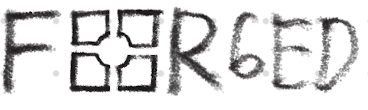
The final logo uses a bold industrial wordmark supported by a compact logomark. The central mark has four sides that represent discipline, self-control, responsibility, and brotherhood. Its form is not a perfectly finished square, reflecting the idea that character is continuously forged towards wholeness.
The completed logo system includes:
- Primary full logo
- Standalone logotype
- Standalone logomark
- Black-background and primary-colour variations
- Minimum-size specifications
- Clear-space rules
- Approved background applications
- Logo-misuse examples

After selecting the logo, I developed the supporting visual identity. The colour palette was designed to feel controlled, grounded, serious, and recognisable.
Black - #0B0C0C: Communicates authority, restraint, and visual strength.
Off-white - #FFFAF2: Provides clarity and a warmer alternative to pure white.
Deep Red - #800007: Suggests urgency, conviction, and the heat of the forging process.
Dark Navy - #00284E: Adds stability, seriousness, and emotional depth.
Supporting Greys: Create hierarchy, structure, and flexibility across different layouts.
Black and off-white form the foundation of the identity, while deep red functions as the most recognisable accent. Navy and grey support the system without weakening its disciplined character.

The main display typeface is Termina Bold. Its geometric and constructed letterforms support the industrial character of FORGED. Neue Haas Grotesk Display Pro is used for supporting headings and body text to maintain clarity and legibility.
The typography hierarchy consists of:
- Header: Termina Bold
- Subheading 1: Termina Bold
- Subheading 2: Neue Haas Grotesk Display Pro 65 Medium
- Body text: Neue Haas Grotesk Display Pro 55 Roman

A structured repeating pattern was also developed from the geometry of the logo. It can be applied as a background, border, or controlled accent without competing with the main content.
The icon-development stage began with approximately 100 possible symbols connected with strength, restraint, discipline, routine, mental health, leadership, brotherhood, and campaign touchpoints.
During consultation, the lecturer advised me to prioritise symbols that communicated controlled strength rather than conventional physical power. Strong directions included a pillar, book, forearm grip, clock, shield, anchor, reins, gauge, open palm, pause symbol, balance scale, compass, journal, cornerstone, and torch. Symbols such as lions, bulls, clenched fists, crowns, barbells, and hammers needed careful handling because they could easily suggest ego, aggression, dominance, or fitness culture.

The final core icon set represents responsibility, teaching and principles, brotherhood, discipline, and self-control. The symbols use strong geometry, consistent visual weight, sharp alignment, and controlled negative space.

The supporting utility icons cover location, email, telephone, shopping, profile, and calendar functions. They extend the same geometric style into practical digital and corporate applications.

The photography direction is cinematic, grounded, and emotionally restrained. It uses low saturation, strong contrast, subtle grain, and documentary-like moments.
Quiet Confrontation shows a man facing his reflection, communicating self-awareness, restraint, and honest self-assessment.
Built in Silence shows a man working alone in a focused environment, communicating responsibility through private routines and consistent action.
Strength in Brotherhood shows young men in an honest conversation, communicating support, accountability, and shared growth.
FORGED avoids photography centred on flexing, vanity, dominance, artificial corporate success, or exaggerated positivity. These directions would weaken the focus on restraint, responsibility, and authentic connection.

The identity was applied to a letterhead, document cover, and business card to demonstrate how the logo, typography, colours, grid, spacing, and visual elements function in professional contexts.
 Fig. 3.13. FORGED Brand Guideline Progress, Week 9
All strategic and visual components were then compiled into the final FORGED Brand Guideline. The document became the official system for the social-media content, field journal, merchandise, website, podcast teasers, exhibition booth, and final presentation developed in Assignment 3.

4. FEEDBACK
Week 6
The strategic foundation from Assignment 1 needed to be reorganised into a
clear brand overview. The purpose, vision, mission, values, positioning, and
tone needed to remain connected with mental health awareness rather than
becoming only a masculine lifestyle identity.
Week 7
The logo needed to be developed as a complete system rather than a single
mark. It should function as a logomark, logotype, and full lockup while
remaining recognisable at different sizes and on different backgrounds.
Week 8
The visual language needed to be expanded through colour, typography,
photography, pattern, and icon development. The industrial logo, restrained
imagery, and direct copywriting needed to feel like parts of one consistent
identity.
Week 9
The lecturer advised me to avoid symbols that relied too heavily on physical
power or dominance. Rulers, anchors, reins, gauges, open palms, pause symbols,
balance scales, compasses, journals, breathing, forearm grips, cornerstones,
and torches communicated discipline and control more accurately.
I was asked to select approximately 10-15 of the strongest symbols and redraw them using consistent geometry, visual weight, alignment, and negative space. After reviewing the refined system, the lecturer responded, "Good job! Looks good!" and advised me to use the icons in the submission.
Week 10
The completed Brand Guideline was submitted as the foundation for the final
campaign applications. The main priority was to maintain consistency and
ensure that every visual element remained connected with control,
responsibility, emotional intelligence, and healthy self-discipline.
5. REFLECTION
Experience
Assignment 2 transformed FORGED from a campaign proposal into a complete
visual and verbal identity. The most challenging part was maintaining a
strong masculine character without relying on visual clichés connected with
aggression, dominance, or fitness culture. Every design choice needed to
express strength together with restraint.
Developing the logo, typography, and colour palette gave the campaign a recognisable voice. The icon system required further critical thinking because individual symbols could change the campaign's meaning. For example, an open palm communicated restraint more accurately than a clenched fist, while a forearm grip represented accountable brotherhood more clearly than a generic group symbol.
Observation
I observed that consistency is created through relationships between design
elements rather than repetition alone. The identity became more convincing
when the logo geometry, icons, pattern, typography, photography, colours, and
layout all communicated the same controlled character.
The tone of voice required the same level of control as the visual identity. Direct writing could be memorable, but without balance it could become judgemental. FORGED therefore needed to confront harmful ideas while still giving the audience a constructive direction for growth.
Findings
This assignment taught me that a Brand Guideline is not only a presentation
of final visuals. It is a decision-making system that explains which choices
belong to the brand, why they belong, and how they should be applied.
Completing this system made the following assignment more coherent. Instead of designing applications randomly, I could evaluate each outcome against the established purpose, values, positioning, personality, and visual rules of FORGED.


Comments
Post a Comment